
Description
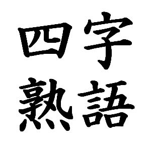
Total of 5 different print font styles in addition to print style Micho tai font
See examples
**Please note that font styles are chosen based on the word/sentence**
Why does this matter?
Japanese culture has a deep and nuanced relationship with typography and lettering — it goes far beyond aesthetics.
Calligraphy (書道 Shodō) as a Foundation
Calligraphy is considered a fine art in Japan, not just handwriting. The brushstroke carries the personality of the writer — their discipline, emotion, and spirit. This means Japanese people are culturally trained from childhood to read feeling into letterforms. A font isn’t just a container for text; it’s an expression of character.
Fonts Signal Social Context Typography in Japan communicates tone and register immediately:
- Mincho (明朝体) — serif-like, with brush-influenced strokes — feels literary, serious, traditional (used in books, newspapers)
- Gothic (ゴシック体) — clean, even strokes — feels modern, neutral, approachable (used in signage, UI)
- Brush fonts (筆書体) — feel artisanal, authentic, powerful (used in izakayas, martial arts, traditional shops)
- Rounded Gothic (丸ゴシック) — soft corners, feels friendly and cute (used in children’s content, casual brands)


Reviews
There are no reviews yet.